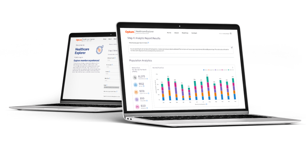
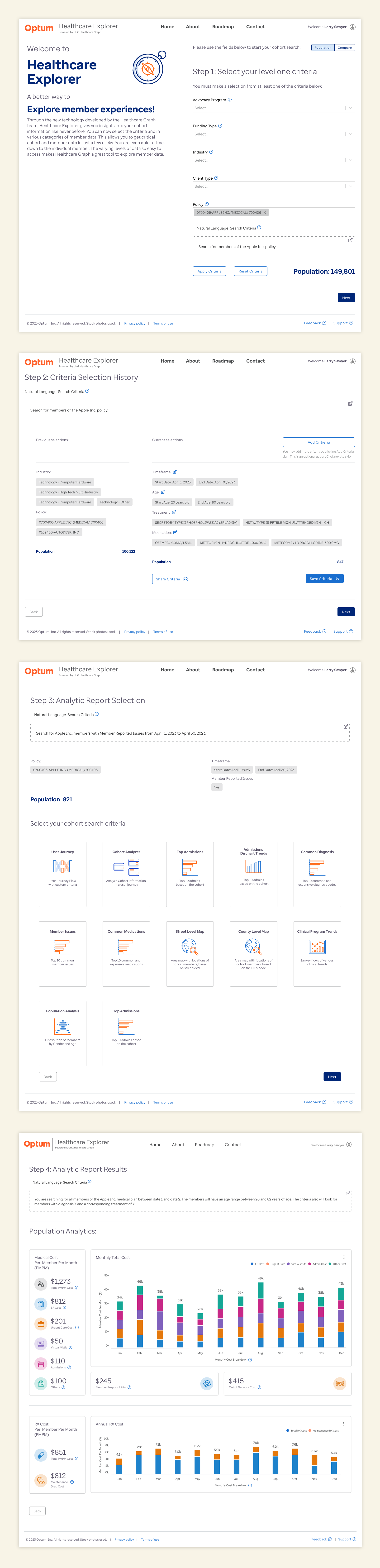
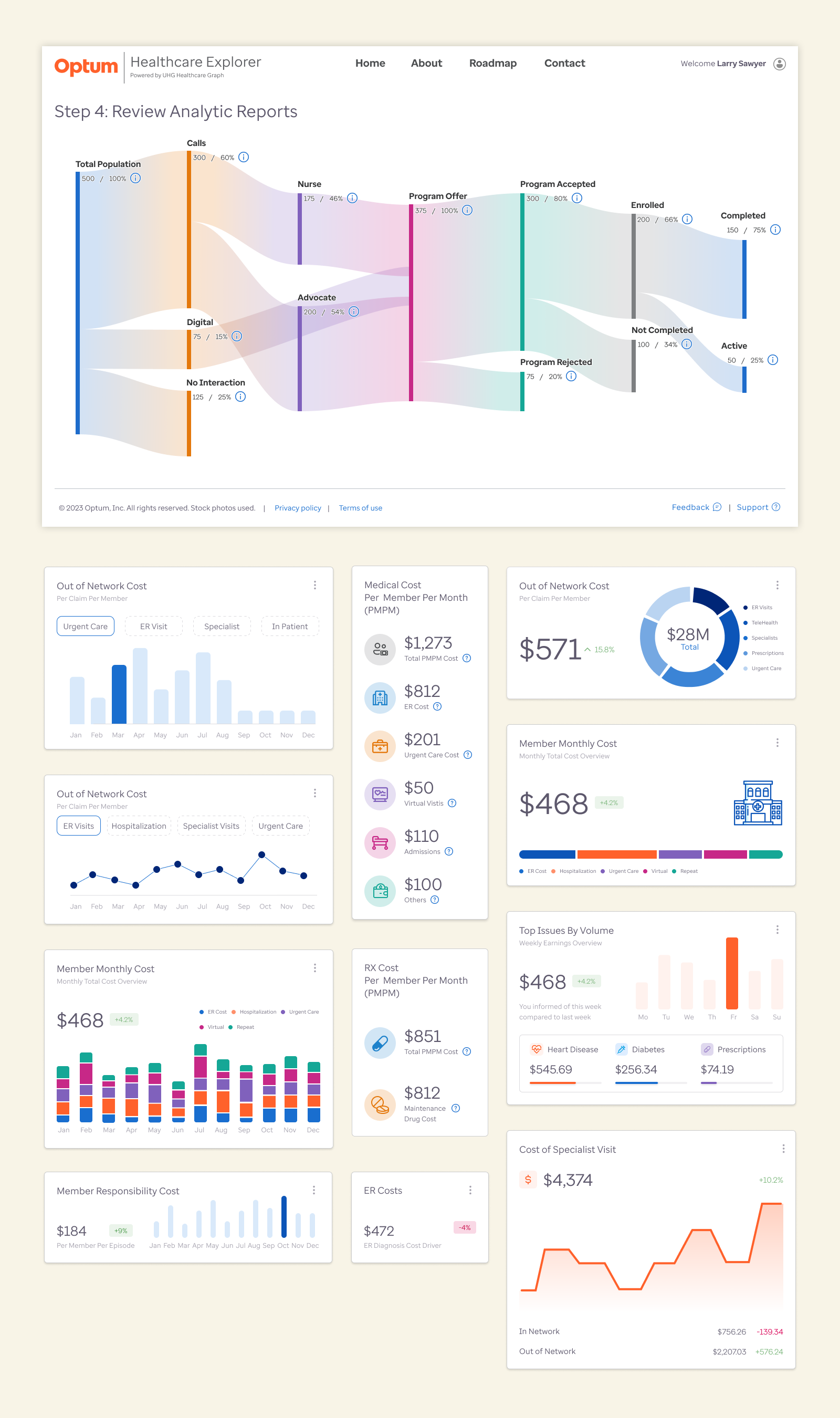
Optum Healthcare Explorer

Company: Optum Health   |   Healthcare Graph Team

Role: User Research, UX/UI design; Data Architecture; Data Visualization 

Resources: Figma; Miro, MUIQ, HighCharts, Photoshop; Illustrator, Powtoon

The Challenge


Optum’s Healthcare Graph team measures the tens of millions of interactions happening across United Healthcare’s network and is responsible for solving the technical challenges that arise during this process. This team is tasked with creating and implementing B2B and B2C solutions to make critical data accessible to Optum and United Healthcare and their partners. The Healthcare Explorer product is a proof of concept that utilizes the advocacy services that spans tens of millions of members of the largest healthcare company in the world. I was tasked with taking this proof of concept tool and building an enterprise level product from 0 to 1. This product gives Optum and its business partners the ability to connect the more than 100 billion data points across the organization. 

This effort was created to increase positive patient outcomes across the entire healthcare population by providing easy access to dozens of search criteria. The process needed to create an intuitive way for users to connect data and produce custom analytics and reports.

The Opportunity


The Proof of Concept product provides the solution that easily correlates the more than 100 billion data points across the data of tens of millions of members. This provides access to data and reporting capabilities that enables ad hoc analysis for member advocacy teams. The interface and experience I designed provides these teams access to data that allows users to make intelligent queries and create custom reports and analytics.

The goal of the new enterprise level product needed to be more intuitive and interactive for the users than the previous prototype. The proof of concept was very powerful, but did not take advantage of the best UX practices and design thinking.

Thus, the goal was to allow users to utilize the analytical power of the product while making it easy for users to filter through the dozens of categories of criteria in an efficient and streamlined way to ensure the proper and accurate output of data to help find areas to improve healthcare outcomes for tens of millions of members.


The Process


The team needed to understand the user issues with the prototype and find creative and intuitive ways to solve them. I implemented the product design process which focused on the five steps for product design. This includes the following:

  • The Discovery Process
  • The Requirements Gathering
  • Ideation of concepts and designs
  • Prototype creating and High Fidelity Design
  • Evaluate and Test

The Discovery Process

I had the opportunity to work with a PhD level user researcher to help us find areas to increase usability, while removing the various challenges the proof of concept had in the user experience and the user journey flows. We performed several workshops and conducted more than a dozen user interviews. This included working with product owners, data scientists, business analysts and executive leadership. 

From there we created the most impactful user personas. Each user persona outlined the details of the user and their role, the data and areas they were most interested in and their decision-making impact. This allowed us to understand and prioritize the needs and requirements of each persona. We then balanced those needs against the business and product objective. This approach and analysis helped us prioritize the user needs, the business needs and the member needs, all while having those results be shown in the product.


User Interviews and Workshops

We conducted over a dozen different user interviews with stakeholders, member advocates, product leaders and subject matter experts to learn what their needs and desires were for this new product. This helped us understand the areas the new prototype worked well and met their needs and expectations. We also learned about the areas in the prototype that didn’t work well or that users were confused by. We included those areas for improvement into the requirements.


The Insights and Results

After conducting more than a dozen interviews with various users across several user personas, it was clear that the prototype usability needed to be improved. Many user journeys could not be successfully completed by the users. Also, when discussing and describing their experience, the results were far below what would be acceptable.

Overall Sentiment: 67% Negative

User Journeys

Given all that we learned during our research and user interviews, we found that the complexity of the user journeys need to be made more intuitive and  easier to understand. We focused on the most common and most critical paths for users to select the correct search criteria to get to their expected endpoints. We did this by implementing a process wizard that will help users step through the various search criteria selection.

We also implemented a on-screen user tutorial that walked the user through the various details and selections on each page. This was done to help ensure users would gain an understanding of the process of the product and increase their success rate to get to the expected endpoints and reports and data visualizations.

Style Guide and Branding

Optum had recently gone through a complete re-branding, so I worked closely with the branding and accessibility teams at Optum to ensure branding and accessibility best practices were followed and applied in the UI and Data Visualization designs. 


I also created a series of customized icons that fit the various topics, categories and details the user would encounter throughout the product. These were implemented to increase user engagement and understanding of the various complex data elements, information categories and service details.


The Focus

After the first round of user interviews and testing of the original prototype, we got a clear indication on the biggest issues with the product and the various user flows. We needed to make it easier for the users to get to the desired endpoint even though many users would not have much familiarity with the product.

Our goal was to increase the overall NPS score, as well as increase the user’s positive sentiments when using the product.

  • Make the user interface and experience cleaner and more intuitive for experienced and non-experienced users.
  • Make the user input controls easier to understand and put them in an order that follows the user logic for selecting various criteria.
  • Ensure the new design follows the Optum Branding and style guides
  • Implement the Optum Design System components, and where needed, advanced various design patterns and data visualizations.


Data Visualization & Design

During this project, I was tasked with creating a new data visualization language and set of design patterns. These design patterns needed to take into consideration the complexity of the data being reported. The data also needed to be highly interactive, allowing the user to drill down into multiple levels of data. I created a full library of data visualizations in different sizes with different levels of detailed information. 

This helped ensure the users would not only have accurate and informative data, but it also made it easy for users to share different analytical reports with peers and customers. 


The Results

We performed another series of user tests once the designs were implemented with the design system and the new design patterns for data visualization. The results were overwhelmingly positive. We addressed the major areas of concern, as well as greatly improved the user journey completion rate and increased NPS score by more than 50%.

Overall Sentiment: 77% Positive

The Feedback

Shopping Cart